top of page

HAROON BAKHSH EVALUATION
Jacob Ham
DATE
24th February 2017
Brief.
Haroon Bakhsh is an online entrepreneur, blogger and in the near future a web developer. I was contacted by Haroon to redevelop his personal branding and establish his identity by creating a set of branding guidelines to help set the bar for how his branding should be presented.
The solution was to recreate his branding that was in place but reposition it to create a bigger and better outcome. The logo should be used In the footer of Blog posts, which is to show individuality and to help self promotion and recognition by readers and in commercial work such as client work it will do the same.
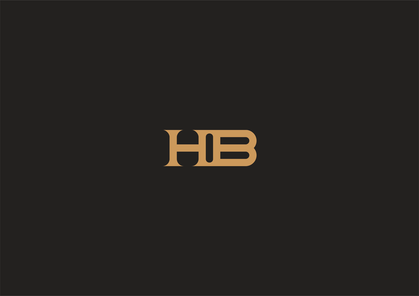
The branding should be represented in a monogram ‘HB’ which is used where less space is available or a smaller logo is preferred and a wordmark ‘Haroon Bakhsh’ where larger space is available.
Client Feedback.
Hi Jacob!
I am extremely impressed at the way you’ve conducted yourself over the past few weeks in creating a logo, it’s branding guidelines and providing immaculate service.
The logo perfectly reflects the themes presented in the brief in an extraordinary way, maintaining professionalism, boldness and presence. The branding guidelines has explained the logo construction in detail and covers every possible aspect one might like to know when inspecting the logo and it’s creation; the colour palette chosen, perfectly suits the key ideas presented to you.
Overall, I would like to say every step of the way you have been an amazing designer from idea to finished product.
Thank you for your service,
Haroon Bakhsh.
Conclusion.
Introduction.
During this project of working with Haroon, I firstly had to plan this project and start developing initial concepts to present to him, before going on and producing a set of branding guidelines and array for him to use.
Research.
Before starting developing ideas, I decided to look at existing personal branding found on the internet. These where based around the logo being a monogram or a wordmark that uses initials to represent the designer or professional. From experience working on my own branding that using two or more letters can make the logo become personal in itself and rather than using an icon that strays down one path. Having a letter based logo can leave the doors open for in the future.
Logo Design.
The crucial part of planning was to make sure that, I didn’t hinder myself with making the wrong choices early on within the project. The logo of the brand would be used within every aspect of the branding, with that in mind, designing the logo first is always necessary. It would seem pointless to spend weeks completing the branding for the logo to not work like intended.
The logo is designed to represent Haroon’s full name “Haroon Bakhsh”, this would be presented in the logo using the initials “HB”. The concept features the two letters joint together with a rounded gap between the two letters. In hindsight, the logo is both clean and different and that’s why the client warmed to the logo. Personally, I love the outcome and compared to the original concept that we were going to take on, the logo feels much more unique.
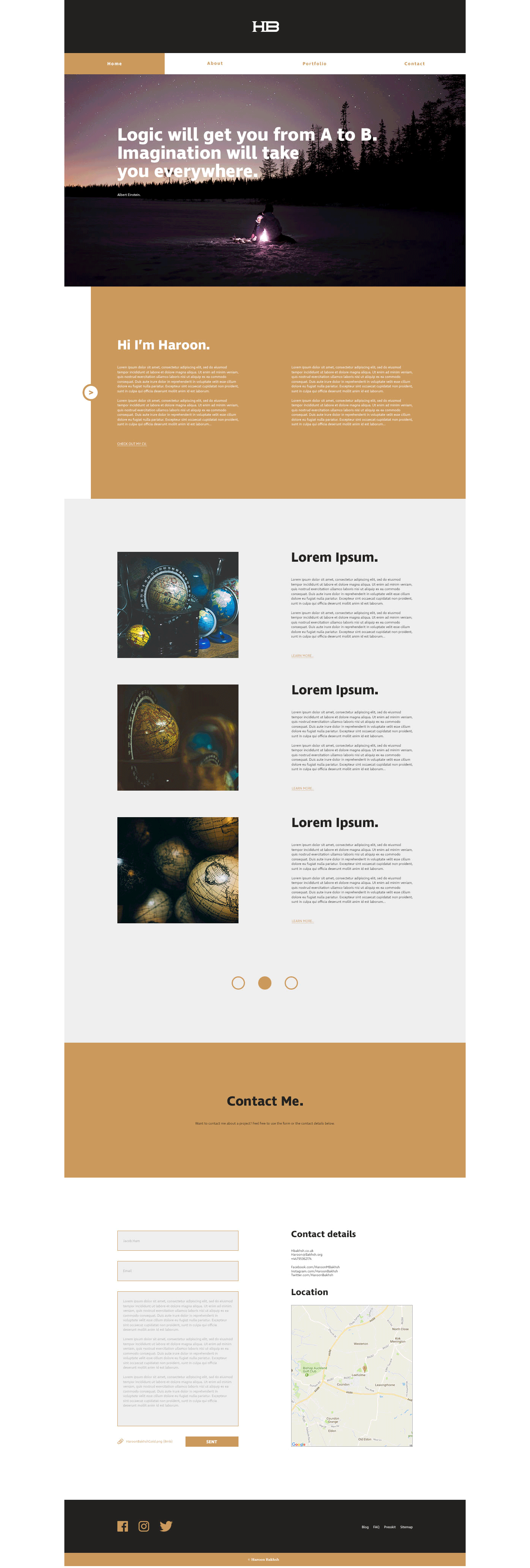
Website.
After finalising the logo design and having Haroon’s approval to move forward with the project, I decided to start developing concepts for the website. The site would be multi-functional, both acting as a portfolio and a blog for Haroon to connect with his audience. The site is interactive from top to bottom, reacting when certain clicks occur, with colour being used to aid this. Haroon’s site is both static and mobile, it all depends on how the user chooses to use the site.
Brand Guidelines.
The final part of this project was to produce a set of brand guidelines that Haroon could use to aid himself or other who plan to work with the brand. Designing these guidelines felt like a major learning curve for myself, down to they needed to be in depth and contained detail about everything that represented Haroon. In decision, I feel that I now have a wider knowledge of creating brand guidelines and working with corporate based clients.
Behance.
Once I had finalised the project and had sent Haroon all the files for him to use the branding and to start coding the website. I had permission to post the outcome to my various portfolios including Behance. Behance is a popular site in the design community that is ran by Adobe, usually when I have work to post I often just upload the A3 landscape brand guidelines to the site and call it a day.
In this situation and in the future, I wanted to create the project from scratch, the benefits of this being that in the end the outcome would look more presentable to viewers, this meaning a higher chance of gaining followers or even better getting featured on a curated gallery. I am happy with how the outcome of the Behance project turned out with it being interactive and becoming more appealing by containing GIFs showcasing the designs, scrolling through colour variations or typography of the brand.
Self reflection.
Throughout this project, I have had to manage my time effectively, with working on other briefs alongside this one. Personally, I am pleased with how I went about completing this brief, feeling that I have succeeded expectations and deadlines I had set when beginning this brief back in early January. Having over a month and a half to fully finalise the brief was more than enough time to produce the highest quality work as possible.
Working with live clients is always an experience that is beneficial and one that I am grateful to be presented with a project, especially as in depth like this one. I feel that undertaking this project and finishing it, has helped me to developed further as a designer. Now having a wider knowledge of both branding and working with industrial clients, this gives me, more work to add to my portfolio which includes a testimonial that can be shown to grab the attention of potential future clients.
Overall Summary.
In conclusion, I am happy with the work I have produced as I feel that it represents the client in both a professional way and a personal one. I feel that I have managed to hit all of the requirements of the brief, managing my time effectively and managing projects at the same time defiantly was a lot easier than I had anticipated at the start of the brief. In the future I hope to manage multiple branding tasks alongside each other, with having the ability to code websites, therefore making the process easier for the client not having to search for a coder.


bottom of page