PERSONAL BRANDING FINAL OUTCOME
Jacob Ham
DATE
20th March 2017
DATE BRIEFED.
2nd March 2017
DEADLINE.
18th March 2017
Original Brief.
In preparing for my future career as a Graphic Designer It would be essential to develop an appropriate logo and branding for myself as a freelance graphic designer. It would be useful to also produce a range of personal promotional materials. These should include a Business card, Letterhead and a T-shirt or hoodie design. It would be crucial to also consider my logo on a range of other merchandise and products such as leaflets, flyers and posters that may promote my services in the future.
New Brief.
To redevelop my current branding, but keeping the logo the same however redesign my brand assets to create a higher sense of professionality. Design guidelines for the brand that never existed during the time of the original rebranding in early September.
Project Aims:
Throughout this project, I aim to;
-
Demonstrate professional working methods that explore the creative process and its cycle.
-
To Further establish both my brand and branding after being in use for nearly six months.
-
Reflect on ongoing work throughout the time during this project.
-
Create a full array of branding with strict guidelines for both logo and assets.
Project Planning.
2nd March 2017.
-
Start redeveloping my branding, focusing initially on refining the logo and creating a new colour scheme with both meaning and professionalism being the key.
6th March 2017.
-
Start redeveloping current brand assets along with creating a more professional CV template.
8th March 2017.
-
Start producing personal branding guidelines that are both consistent and strict but being straight to
the point.
12th March 2017.
-
Finish the first draft of the guidelines and start proofreading and making final changes to the
InDesign document.
18th March 2017.
-
Finalise my new branding and create two PDF’s of the guidelines and send them for printing via
online service.
20th March 2017.
-
Publish my new branding to all my current platforms along with republishing “Personal Branding”
on Behance.
Introduction.
The concept of this brief was to redevelop my branding but keep the logo design the same. Upon starting this brief, one of my four objectives were to reflect on every decision I made and in this reflection, I will be doing that in much more detail.
Logo.
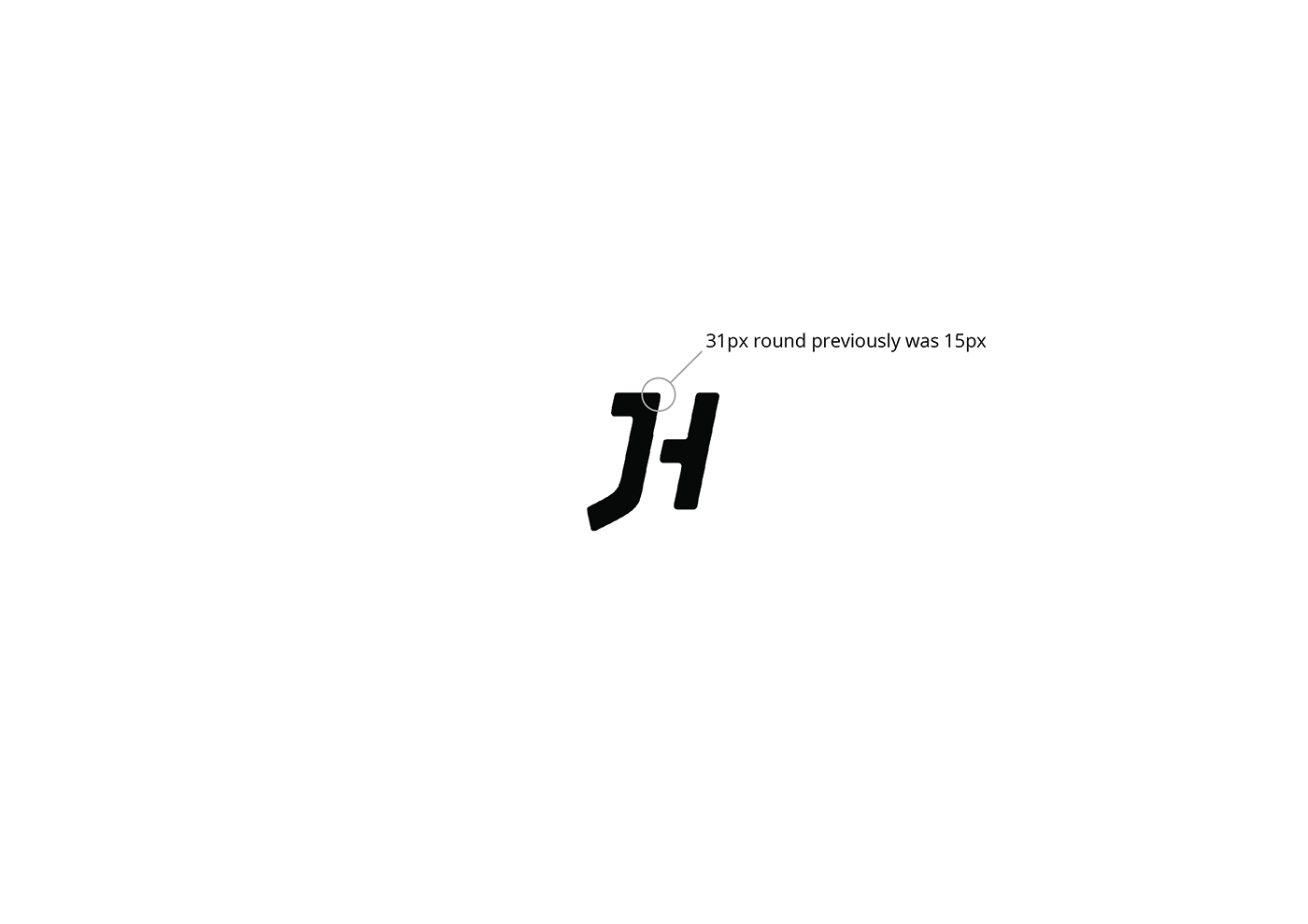
Although back in 2016, I was more than happy with the outcome of my new branding, however I love the small details that people do not often look at within logo designs. So, I decided to go back and redevelop it ever so slightly, but not enough that it obvious. I changed the rounding on the top part of the letter “J” from 15px to 31px to relate even more to my birthdate, meaning the logo is even more personal than it previously was.
The colour purple or #250833, this colour hex stands for the birthdate of my biggest inspiration, my Nana. Who forever pushed me to challenge myself even more the following day and is someone who I have learnt how to be a better person from.
The white being the lightest shade of the purple, it is used to contrast the logo when purple is the main background colour in use.
Assets.
The assets of my brand, now are something that I am actually proud of and feel that they reflect the standard of my work, which is rather important for attracting clients to working with me. Overall my branding and logo tie in perfectly with the grid system being personal and keeping every aspect.
Brand Guidelines.
At the start of my original branding, I had not developed branding guidelines to both support and protect my brand, but nearly nine months on. I have grown massively as a designer, it was best to create protection for my brand to ensure I do not misuse it. The guidelines in conclusion are one of my strongest, the logo, colour, typography and assets are protected and explained in great detail, and have raised the bar in terms of quality for my work and personal brand.
Reflecting on my work.
I feel that during this brief, I have critically evaluated every choice I have made from start to finish. Analysing right or wrong decisions such as setting of type or developing my website template. In the future, I will definitely be evaluating projects in detail. Making sure that every aspect of the design process has both reasoning and method behind it.
Deadline.
I specifically set myself a short deadline, due to the time of the undertaking of the brief, with it being a busy time in terms of both client and class work. This meaning I really wanted to test myself and handle a larger work load, than I have ever undertaken before and can fairly say that handled it with ease. The guidelines had been sent to print on the 19th which was a day earlier than planned in
the brief.
Improvement.
It’s fair to say that the improvement in the work produced compared to the outcomes from 2016, is drastic and reflects my progress I have made this past year. Although last year I still got a major buzz from seeing my brand be printed, it felt more special this time around due to being happy in every aspect of the branding, not just the logo design and I think the colour change and grid system has enhanced this feeling a lot.
Project links.
https://www.behance.net/gallery/45004559/Jacob-Ham-Personal-Branding
https://dribbble.com/shots/3391564-Personal-Branding
https://dribbble.com/shots/3391583-Personal-Branding-Guidelines