CREATIVE CV REDEVELOPMENT
Jacob Ham
DATE
6th March 2017
DEADLINE.
NA
Introduction.
As a part of redeveloping my personal branding and preparing for my future career, it was the perfect timing to create a new CV for myself, that would tie into the branding I had developed.
Research.
Before revising my CV, I decided to research into existing CV's used by other creative professionals in design.
Loic Guillout.
The first CV I looked at prior to redeveloping my current one, was for Loic Guillout. Loic is a French graphic designer and the aspect that stands out the most to me is the way of highlighting skills by using a chart or percentage to display aspects of design or general skills that you are most comfortable with. Other aspects that I like, is the usage of icons for Operating Systems such as Apple and Mac. This is a great addition as in today’s society having experience with various computers can be the difference between getting hired or not.
https://s-media-cache-ak0.pinimg.com/originals/a8/27/7c/a8277cf42606b8507c23625d97e310a9.jpg
Alexis Stevenson.
The last CV I looked at is for a marketing manager called Alexis Stevenson. This final design stood out to me for the wrong reasons, with it being overpowering with information. Compared to the other two, it has far too much writing and this will easily bore employers meaning they will look at the CV and never touch it again. This should be avoided.
http://orvis-center.com/wp-content/uploads/2017/03/9001165-best-graphic-design-resume.
Old CV.
My old CV was straight up a failure looking back on it, I originally designed this when I created my new logo in late 2016. The overall feel was looking professional but the content and setting of the entire CV was incorrect and should have been totally different. The following changes should be changed to ensure the CV is successful this
time around;
-
The logo should be presented in full colour.
-
Headings should stand out more than the subheading.
-
Remove “Honours & Awards” until it is actually relevant or when there is something to put in rather than “N/A” this looks unprofessional.
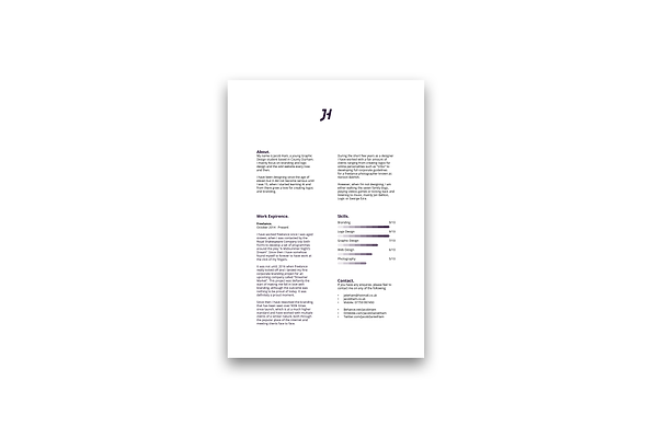
Reflection of my new CV.
The new CV follows the same grid system as my letter head, using 31mm margin and 25mm gutter. The aim of this CV was to feel professional but become more personal and reflective on me and my work this time around, after all since version one of my branding I have grown in massive strides as a designer and there was no better way to showcase that. I chose to remove any work experience I had with working in an online based studio as they really don’t feel like achievements compared to working freelance or working in an actual studio and in
the environment.
The overall look of the new CV is professional and appealing on a creative level, containing crucial information about myself and my specific set of skills as a designer. I feel that compared to the previous CV, this one gets straight to the point as does not waste time, although I have not included my grades I feel that showcasing work experience and my skill set felt more appropriate for a creative CV. Although in the future I may expand my CV and create a double sided A4 that contains extra information on the back when needed.
Entire project reflection.
https://www.jacobham.co.uk/personalbrandingoutcome
Project links.
https://www.behance.net/gallery/45004559/Jacob-Ham-Personal-Branding
https://dribbble.com/shots/3391564-Personal-Branding
https://dribbble.com/shots/3391583-Personal-Branding-Guidelines